Man Ray
The first artist to have explored light painting was Man Ray. Born Emmanuel Radnitzky, (August 27, 1890 – November 18, 1976) was an American modernist artist who spent most of his career in Paris, France. His contribution to light painting came in his series "Space Writing". The title of the series is based on the literal approach to writing in space. In 1935 Man Ray set up a camera to produce a self-portrait. He opened the shutter of his camera and used a small penlight to create a series of swirls and lines in the air. These swirls deemed to be random patterns until 2009, where it became apparent that they were a copy of Man Ray's signature. This discovery occurred when an image from "Space Writing" was viewed in a mirrored reflection.

Mirrored Image of Man Ray's image showing his signature.
|
Observing the works of Man Ray has enlightened me on the significance of the discovery of light-painting; as it shows the drastic impact it had on surrealist photography's movement. Secondly, it wasn't until Man Ray that light-painting was first conceived as an art form, rather than means of mere documentation. Understanding these principles of photographic development has showed me the potential light painting has when increasing the character of a photographic image. Therefore, I began to experiment with the light painting technique myself to see what results I could generate. |
Light Painting Experimentation

After observing Man Ray's "space writing" series I went about starting my Landscape project by experimenting with the technique of light painting. Light-painting is a photographic technique where exposures are made by moving a light source or by moving the camera. My intention to do this was to develop new, abstract techniques which would help me generate more visually interesting images later on in my project. I feel that the products of my experimentation are useful photographs that have provided me with inspiration to develop more interesting landscape imagery. Furthermore, I wish to continue to experiment with the light painting technique to see what more visual effects I can create. In this set of images above, I created light-patterns using a small key-light. I did this in a very dark environment as to create these images it is necessary to use a long exposure in order to successfully create the light-paining effect. Otherwise the images will be over-exposed and visually inconceivable. With the finished products I then imported them in to 'photoshop'. Here, I mirrored them to create a symmetrical effect. I did this to add more character to the photos and to expand the intricacy of the patterns. I edited, in addition, the colour levels and contrast of the photo to reinforce its appearance; making it more visually striking to my audience.

|

|

|

|

|

|
Patrick Rochon - 'WIRED'

From 'WIRED' by Patrick Rochon
To expand upon my research in to light painting I studied the works of contemporary artist Patrick Rochon. Rochon is an award-winning Light Painting photographer, and has been doing light painting photography for over 19 years. He won first prize at the Nikon photo contest in Japan. Rochon does Light Painting photography for various fashion and rock magazines as well as CD jackets, DVDs and other promotional materials. Rachon is based mainly in major cities such as Tokyo, New York and Paris and has lived in either one of the three for 15 years.
In Rochon's series WIRED, he presents a numerous amount portraits that exercise the light painting technique.
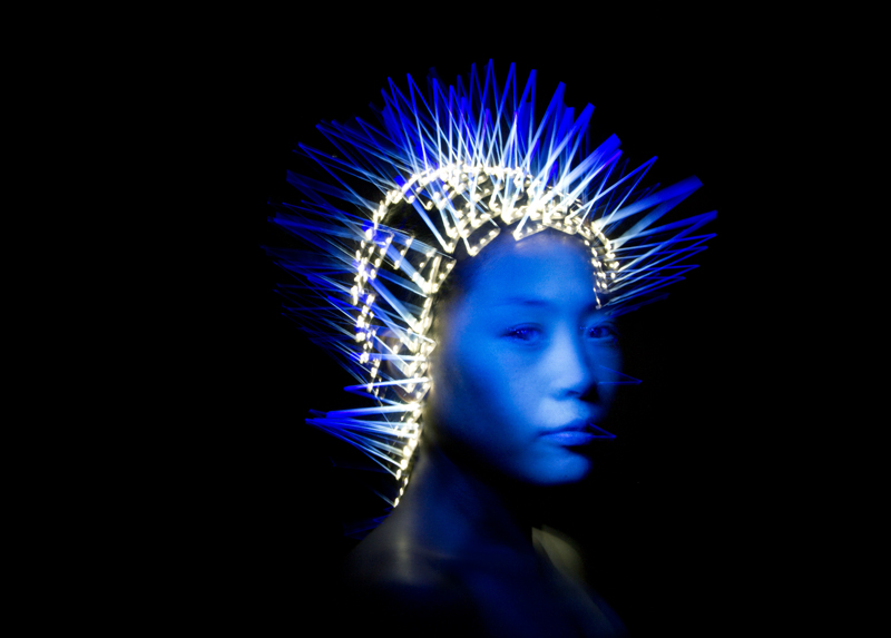
- The photo on the right was created by attaching several LED lights to the subjects hair. Initially lights were attached to the subjects face, however Rochon said that this caused the human shape to disappear completely. Rochon's intention for this style of light-painting was to reflect on his photographic series title. Here, Rochon demonstrates people's fixations with technology; positioning the lights on the individuals heads symbolises technological addiction. The beams of light seemingly escaping from the subjects head or mind, show how the individuals thoughts manifest electronic and technological process.
|
|
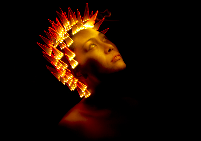
Patrick Rochon Response
In this response to Rochon I manipulated the lighting so that it would reinforce the presence of the subject in the photo. Furthermore I wished to re-establish the theme presented through his original 'WIRED' pieces; representing the ideas of materialistic indulgence with technology. However, due to a lack of resources I could not entirely replicate Rochon's photographic endeavours. Instead I manually manipulated the light around the head of my subject to achieve a similar effect. The images display an appropriate amount of luminosity in accordance to the pitch black backdrop. This generates a visually striking contrast of colour and darkness, that firstly, emphasises the subjects presence and secondly, enhances the patterns of light.

|

|
Nadav Kander - Half Life

Nadav Kander is a world renowned London based photographer known for his portraiture and landscape photography. Kander visited Chernobyl where he took a series of photographs to which he called "Half Life." This photo displays a dilapidated room from a nursery (kindergarten). It shows three neat, straight rows of rusted bed frames with a backdrop of rotting, peeling walls. The photographs has a low contrast as well as a low saturation and lack of vibrancy which provides the photo with a cold, lifeless nature. His intention to use this lack of colour is to truly emphasise the texture in the photo; such as the peeling walls and the rusted metal of the bed frames. This generates, further, a lifeless effect which reflects on the bleak ambiance of the abandoned environment. The frame of the photograph does not contain the entirety of the scene. This, therefore, accentuates the amount of occupants this room once had. Kander incorporated this to remind his audience about the people that once occupied this nursery.
|
This is one of my most admired pictures from Kander's chernobyl collection. Kander's focus on the preserved mural contrasts the texture and colour from with the rest of the outstanding decrepit environment emphasises the degraded appearance of the room. Furthermore similar to the photo of the Kindergaten, the display of colour represents the people and life that used to occupy the space; it is almost as if the Mural is the last remaining goodness of the room. Kander makes this apparent by making the Mural the ultimate subject of the photo. In addition, in the centre of the photograph a malnourished tree is shown. Kander centering this tree in the image highlights the gradual take-over of nature and how ultimately Chernobyl will be consumed, used and taking over by it.
|

|
Swimming Pool Response
After observing the work of Nadav Kander I visited an Abandoned Swimming pool to respond to his theme of abandonment, but to also observe the formal elements; such as texture, colour/hue and tone. I wished to try and accentuate the delerict nature of the swimming pool, focusing mainly, similar to Kander, on the detailed decay of the scene. In contrast to Kander's work, however, I accentuated the hue of the images, making them more vibrant and saturated. I felt that this emphasised the decrepit nature of the scene through the means of contrast. Initially, however, I attempted to commemorate the work of Kander by creating an image with a seemingly bleak tone. This was to reflect the haunting nature of the abandoned scene.
Photographing the abandoned pool and exploring the formal elements helped me obtain ideas about cooperating perspective and texture. This has helped me broaden my knowledge about the significance of detail in my imagery, as well as expanded my knowledge of the impact visual perception has on the visual aspects of a scene. Furthermore, focusing on individual aspects of a scene has caused me to indulge in different abstract forms of Landscape presentation.
Depth Of Field
Negative Space
|
Tone
Hue
Texture/Focus
|
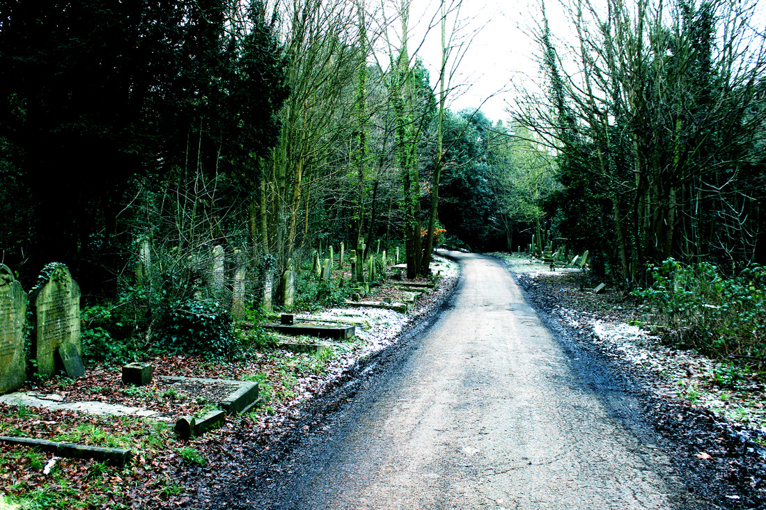
Walking Task - Negative Space
The Woods
I was set a task to explore specific environments and further my experimentation with the formal elements. I photographically documented my journey when I walked through a woodland trail. Observing this specific subject matter was a great opportunity to pay close attention to detail in a natural, woodland environment. After finishing my journey through the woods, I visited a local allotment to capture more subject matter. I took a number of images and chose to use my four favourite images for each destination. In the following sets of images I explored perspective, texture and depth of field. I find that these observations showed me the visual effects of close-up photography and the amount of detail I can emphatically demonstrate through it. Furthermore, I was able to explore different approaches to perspective and depth of field in these images; which has given me a better understanding of the different compositions and techniques I can exercise in my photography.


|


|
The Graveyard


|

|
The Allotment

|

|
David Hockney - Photo Collage

Merced River,Yosemite Valley, Sept. 1982

Pearblossom Highway, 11th-18th April 1986, photographic collage
|
David Hockney is an English painter, draughtsman, printmaker and photographer based in Bridlington, Yorkshire and London. Hockney is considered one of the most influential British artists to come out of the 20th century. In the early 1980s Hockney began to create a series of photo collages which he called "joiners," first of polaroid prints and then later of 35mm. Using a varying number of polaroid snaps which captured different perspectives of the same scene, Hockney combined these individual images to create an overall, whole photo collage. This respects the traditional landscape approach to photography, yet simultaneously enforces a more abstract art-form. Hockney's aims were to display and promote the art style of "Cubism." Furthermore, capturing numerous individual images allows his audience to gain a more refined understanding of his perceptions at the time.
As well as this, the use of photo collage has allowed Hockney to incorporate more subject matter that he would otherwise be unable to do. When capturing a single image, one is confined to the frame of the camera lens. However, when capturing a number of images you can expand upon the final images view as much as you desire. I found this aspect of Hockney's photography particularly appealing as I could present the entirety of my visual perception through photographic panoramic imagery. |
David Hockney, "The Joiners" Response
After observing Hockney's work, I wished to attempt to create my own interpretation of his "Joiners" pieces. I find that this photographic approach allows on to capture relatively simple and uninteresting subject matter, albeit through using the artistic technique of "cubism" you are able to elevate its visual appearance and interesting appeal. With these responses to David Hockey's work I used less images to form the whole panoramic image than the amount Hockney used. I believe that doing this created a better visual effect and is more appealing to the eye of the audience. Adding to this I feel that using less images is a better representation of the effect of the cubism technique. In these works I decided to capture an image of the ground directly in front of me as I believed this reinforced my presence in the photograph. In addition, I went about creating a dynamic of tones and colour in the photographs. Therefore, I fluctuated with the use of exposure in each single image. I find that creating a variation of tones through the image allows me to generate a different emotional perspectives through the use of colour differentiation. I very much enjoyed the process of creating these images and I am happy with the end results. I feel that I will continue to experiment with this technique further, and even if I don't explore Hockney's technique further, I will take in to consideration the exercise of abstracting images to make them more visually appealing and interesting for my audience.


|


|
Strand 1 - Light and Shadow

I then, for the this second photo, increased the ISO to 3200 and the shutter speed to F22. This helped me achieve a much more clear image of the shadows in the picture. Furthermore I took this photo further above from the ground, to show more of the subject shadows and to attempt to gain a better image of the sun, as well as showing its height more accurately.

I took the image here from a downward slope. My intention for this was to emphasize the sun's height and to get a elongated shadow. I also took a picture from a relatively low level near the ground. This was to fully display as much detail of the snowy ground as possible, which I feel adds more effect to the trees shadows. However due to the new location the picture became overexposed. To try and overcome this I increased the ISO to 6400 but left the aperture size at F22, also the same shutter speed remained (1/60 of a second.)

|
I went out after it snowed heavily and noticed that shadows were particularly vivid as the sun was particularly bright. Although in this photo the shadows are barely visible. This led me to increase the aperture size and the ISO in hope to capture more distinct, vivid shadows as this image had too much of a high exposure. The aperture size of this photo was F16 and the ISO was at 800, shutter speed at 1/60 of a second. Changing these settings in this fashion allowed my emphasises the abundance of shadow in the image.

I then imported the photo in to photo shop and tampered with curves and the photo's light levels to darken the subject matter in the picture such as the trees as well as the shadows to emphasize the brightness of the sun and create a better contrast. However at the same time I wanted the lightness of the photo to appropriately reflect on the actual time of day that the picture was taken.
On the other hand, although this photo was taken from a relatively high level off the ground, I thought the shadows length could be truly emphasized by taking the photo from a ground level. Therefore this caused me to change picture location and capture the image from a different visual perception. 
With the new settings the exposure of the new image increased the vivacity of the shadows. Furthermore the detail of the the ground was also more vivid, which gave the photo more depth. However I then still felt the need to tweak with the exposure of the photo and also tamper with the light levels to better and emphasize the effect of the suns raise by increasing the photographs contrast.
|

Final Edited Photo

Although I entered further in to the tunnel, I still felt the exposure was not high enough in the photo. However I was please with how the focus balanced out the whole photo, providing a good sense of depth. This also payed massive credit to detail and texture in the photo. Nevertheless I took a third photo further down the tunnel and used a higher aperture (F25) to increase exposure and provide a more apparent divide between the light shadow.

|
I took this picture initially nearer to the beginning of this tunnel. This was to not allow the camera to get to exposed to the light. However it didn't display a clear distinction between the light and shadow as the shadow is overwhelming the light source. Adding to this this photo had a relatively low stability. So, I took a second photo further down the tunnel hoping to achieve a better exposure without yet tampering with the sessions.

Even though in this photo the shadows intensity has decreased I felt that it was shared equally between its' and the lights. However this photo has a deficiency of contrast due to the increase of exposure, but I thought that due to the equal balance of lighting I could appropriately edit the lightness and shadows in photoshop. I felt that the edited version emphasized the textures and detail in some parts of the photo, yet decreased texture in other parts due to the increase of the shadows intensity. I would like to achieve a better display of texture in a next photo. |

This photographic development refined my understanding of the uses and visual effects of light and shadow contrast. It releases and accentuates texture and tone in an image and allows one to gear the audiences focus onto particular details where light is more abundant and shadow is not. Although I enjoy the appearance of the photo's developed from this strand, I do not wish to further in their developing process. I believe using this strand idea of 'Light and Shadow' will limit the amount of the London environment that I can present. This is due to having to specifically take photographs of areas in which there's an emphasised sense or abundance of shadow. This hinders the possibilities of subject matter that I can display and I'd rather present a true, natural and life stylistic nature of London.
Strand 2 - Night Time London
-


|
I thought it would be a good idea to attempt to capture London at night as I think it would emphasize the cities beauty due to its' impressive abundance of lights. Firstly I decided to capture night time life in my local area rather than going in to the city. This was to show the contrast between the suburban and the city London environments. In this first photo I kept the exposure relatively low. This was because I thought that initially the amount of light given off would be too intense. However this darkened the foreground of my image. Therefore I increased the exposure by increasing the aperture size and the ISO. I felt that this created a more appealing image as the foreground was appropriately illuminated and the foreground lights were not too overpowering. However I changed the angle of the photo slightly. Although this was a minor adjustment I feel that it decreased the quality of the image and that a better image could be achieved. In this final photo I went back to taking this shot from my original perspective in the first attempted photo. I feel that this provided a better sense of tone on the subject areas and slightly decreased the intensity of the foreground lighting. I then imported this final image in to 'photoshop' to attempt to optimise the levels, tones and lighting of the photograph. When capturing this series of images I paid close attention to light sources; as these were in an abundance in the night time. The abundance of light allowed my to digitally accentuate the subject matter in my photographs. It also allowed me to easily capture a contrast between the light and the night time darkness of the photographs.

|


|

In these four images I paid close attention to colour. The large differentiation of colour and light source in the images allowed me to create a visually dynamic effect. To stress the intensity of light I brought a tripod along with me so that I could capture images with a pro-longed exposure without effecting the detail of the image.
I am extremely happy with the products of my 'Night Time London' theme as I believe that the lighting, tones and colours sourced from the various lights of London have generated an ambient effect which I hope will be exemplified in the imagery. Furthermore, it allowed me to explore areas which are not commonly appreciated in natural light, places which can only be enjoyed properly through the ambient nature caused from the synthetic light of London. However, although I am pleased with my finished products I do not wish to continue my development of the particular theme. This is because I would like to generate a more abstract effect rather than just capturing traditional landscape photographs. Notwithstanding, I intend to project the underscoring techniques of colour upon my later developments. I will assure that when capturing further images I will pay close attention to the lighting and differentiation of tones and hue in the scene.
|
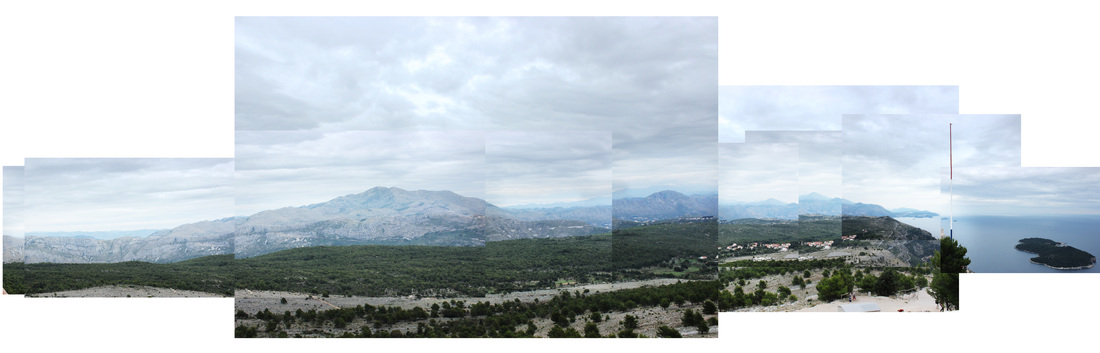
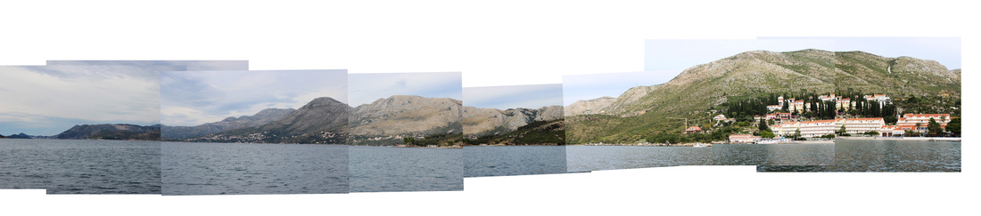
strand 3 - Cubism and panorama
In this set of observations I wished to incorporate the photographic technique of 'cubism'. This technique consists on capturing a number of images on one particular subject. You then combine all the images to create a whole picture. This photographic approach, as you can see, generates an abstract image of squares that collectively create a "single" photograph. The inspiration for using this effect was personally derived from Hockney's series of work 'the Joiners'. To add my own mark, however, to the 'cubism' approach to photography, I decided to use it as an effective medium to creating panoramic landscapes. The photos below were taken on a trip to Croatia and also trips around London. I admire the simple yet profound effect of this particular abstraction; it allows you to respectively show your subject in its full beauty and reality, yet, at the same time, interestingly generate an alternate photographic abstraction. After this first experimentation with cubism, I wish to develop upon the technique further; attempting to incorporate more subject matter, thus creating an even more interesting piece of art-work.

Rhiannon adams
Rhiannon Adams was born in Cork, Ireland and currently lives and works in London. Though she works with a wide range of image making methods, Rhiannon's work is primarily concerned with time, uniqueness, and "place told through the degradation of instant film materials in the digital age." In her work 'Emulsion Lifts' Adams has created a series of collages, created through layering polaroid images. She refers to it as a "ficitonal landscape" and professes that her collages "cross boundaries between fact and ficiton". I feel that this notion is compatible with my desire to create an abstract piece, that still captures my realistic perspective. In contrast to my panoramic images, Adams has captured her photographs from a ground level. I feel that this allows me more freedom to captured the scene on both a vertical and horizontal line of version; whereas capturing a panoramic landscape requires one to solely capture subject matter on a horizontal line of vision. I find that her images demonstrate effective fluctuations of colour and tone throughout each image in the photocollage. It accentuates the effects of cubism, as it highlights the outlines of each individual image, albeit does not tamper with the overall perspective that is created by the collage as a whole. In my later developments, I will attempt to engage with the a similar approach cubism, through the emphatic differentiation of colour and tone throughout the collage. I, in addition, would like to capture numerous images on a ground-level, in order to capture more of my perspective, rather than being limited to observing the scene on only a horizontal level.


|


|
Strand 4 - Photo Collage
After creating these panoramic landscapes, I decided to utilise the same technique but capture scenes that reflect and emphasise my first person perspective. In response to the work of Rhiannon Adams, I began attempting to create photo collages from a ground-level, which I could not exercise when capturing Panoramic landscapes. Furthermore, like Adams, I wanted to attempt to elucidate my perspective on both a horizontal and vertical line of vision. This a creates a greater sense of verisimilitude than what I could produce through creating epic panoramic landscapes, and puts my audience directly "in my shoes". However, I did not wish to emphasise, unlike Rhiannon Adams, the differentiation of tone and colour throughout the images I used in the photo collage. I feel doing this would make the consisting images less associated with eachother; with regards to demonstrating my consistent perspective of the scene I have captured. Furthermore, Adams has dyed her images so that they are all one colour, yet are different tones of the colour. I did not wish to do this as I felt that preserving the actuality of the scenario was crucial in order to generate a true interpretation of my perception at the time.

In this series of observations I chose to continue my responses to David Hockney. However in these responses I have chosen to incorporate a sense of movement and lifestyle rather than just a unchanging, relatively still landscape. I, in addition, chose to focus less on a panoramic frame and create more square framed images. I visited a West London skatepark in order to attempt to capture movement and lifestyle through photo collage. This 1st photo was an experiment to see how well I could present depth in the photo and avoid generating a relatively two dimensional image. However I incorporated a minimal amount of movement, just so I could test the outcome before furthering it later. I feel that this image is visually appealing, showing clear imagery with a sufficient blend of tone. I feel that the foreground subject matter and the imagery in the backdrop are both equally, and appropriately displayed. However I still believe it could be developed further to help generate my full perspective to the audience.
|

In this 2nd photo I captured several images to show my perspective on a horizon, which creates a relatively two dimensional image which I dislike. On the other hand, in this image I decided to incorporate an image of my feet. I did this to give the audience a personal insight in to my perception and to reinforce my presence, as well as placing them, in a sense, "in my shoes". I wanted them to feel as if this was my true perspective even if presented through an abstract means of cubism and photo collage. Furthermore I feel that the commemoration of cubism in this image makes the photo more interesting than a traditional landscape. As well as this, in the image I intended to demonstrate and capture a large sense of movement. However, I wish to develop upon doing this further.
|

Here in this final image I feel like I successfully achieved a great sense of depth which fully displays my perspective at a horizontal and vertical 180 degree angle. I created this depth through focusing on capturing a largely extended depth of field in the collage. Furthermore I enjoy the balance of tone and texture which is manifested in the wood, metal and concrete materials in the image. I believe this gives the image a "real-life" character. In addition, I feel that I have succesfully achieved the desired effect from incorporating an image of my shoes in the overall piece. This creates the effect thet the audience are truly observing the scene from my perspective, almost as if they were "wearing the shoes" in the image. I feel that I have achieved my intention, which was to fully display my perspective to the onlooking audience and yet still provide an abstract, different theme through the photo collage technique.
In further development I wish to incorporate more movement and bring more subjects into the photo. This is in order to create a more interesting image to the audiences eye. My intention to do this is to assure that my audience are constantly observing different fragments of the image as well as just observing the image as a whole.
In further development I wish to incorporate more movement and bring more subjects into the photo. This is in order to create a more interesting image to the audiences eye. My intention to do this is to assure that my audience are constantly observing different fragments of the image as well as just observing the image as a whole.
Photo Collage Development

In this series of developed images I went in to central London in hope to capture a large amount of detail and substance in one image. In this first developed idea I was experimenting with levels and the movement of people. This was for me to see if it was possible to capture moving individuals in not just one, but several images. I feel that I have achieved this, however I would like to incorporate more subject individuals later on, however I am still very pleased with the outcome as I admire this photo's depth of field and how the detail is carried out from the foreground all the way in to the background. Adding to this I feel that the consisting colours in the photo merge and compliment each other sufficiently. I enjoy the mix of grey light tones with the brown/reddish darker tones. On the other hand I wish I could have a achieved a more horizontal 180 degree perspective, nevertheless I think that the good depth of field in the photo makes up for that. Furthermore I also decided to put an image of my standing position in this photo, similar to the one in my previous photo's in the west London skatepark. I feel as if this gives the image a personal touch and reinforces the idea that this image is truly my perspective to the audience.

In this photo I attempted to capture even more movement by capturing the image from a high street corner. This was to incorporate vehicles in the image which deemed to be a struggle at 1st due to their acceleration and speed, however In this photo I feel they have been appropriately captured. Also one of my intentions with this image was emphasise the height of the buildings by capturing images from the base of the building all the way to the top. I did this to create a more "grander" larger image that really came across as three dimensional. Adding to this I feel that once I again I achieved the amount of depth I wished to display. I tired to do this my displaying a subject in the foreground ( The sign post ) which the emphasises the distance between it and the back drop, thus creating a large sense of depth. Furthermore like the other photo I enjoy the amount of materials and texture gained from the road and the buildings. I think all of them compliment each other which I think brings the photo to life. Adding to this in my opinion I enjoy the different shades and exposure present in each individual image as I believe it gives the photo more character and makes a more visually appealing image. If I could change anything about this image it would be that I give it a more "fish-eye" effect to make the image seem a lot more larger. Adding to this I would of liked to create a more horizontal 180 degree angle.
